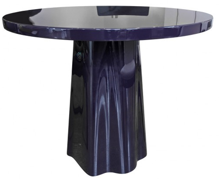
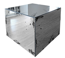
 When most people move and don't need (or want) certain things anymore, they sell their furniture on Craigslist or occasionally leave it on the curb where it is then spirited away before you even get back up to your living room. But if you have (or want) higher-end furniture, you need a better option. For you, check out Viyet, a site dealing in high-end furniture and home accessories consignment. If you're looking to sell, there are a few requirements: the items must be a designer brand, meet the minimum retail price (there are different cutoffs for different categories), and they must be in excellent or good condition, or able to be restored to excellent or good condition with a little care. Once you've submitted your piece for consignment, an expert curator will come to measure, photograph and document the details of the items you're selling. Viyet will help you market and sell your pieces and profits are split 50/50 between Viyet and the consignor. Buyers can find quality pre-owned items for 50% to 80% off the original price. The pieces are by well-known interior designers such as Alexa Hampton and Steven Gambrel or are from retailers like Century Furniture, Mecox, and Tai Ping. Modern and traditional pieces for nearly every room are available. A site like this provides an opportunity to buy a well-made designer piece when you might not be able to otherwise, and even if you do have the cash, it's a great deal. The other thing I really like about Viyet's concept is that it keeps pieces in circulation and combats the disposable culture it's so easy to fall into. No, the pieces aren't in perfect condition (though some are pretty close), but with a little TLC or perhaps some strategic furniture and accessory placement, they'll be well worth what you pay. A few of the items currently for sale that caught my eye, including the Sé Damien Langlois Meurinne table above:
0 Comments
When you're adding global or ethnic touches to your decor, as many are wont to do, it's always nice if the pieces have an air of authenticity. Antique pieces often have a lot of personality, but new pieces can also bring great style to a space. Noted interior designer Sara Bengur recently debuted her newest products, which are inspired by her Turkish background and upbringing, as well as her extensive travels.  Sara has been in business nearly 20 years; her eponymous firm is located in New York. After hearing her name and seeing some of her work in publications for years, I finally had a chance to meet her at the gift show last month and she couldn't have been lovelier. A lot of times when you ask designers what prompted them to create their own product line, the answer is that they couldn't find something they were looking for to use in their projects. "I often design custom pieces for my clients that have been inspired by either my Turkish roots or the location of the house I am working on at the time," she says. After increasing demand that she create her own line of products, she finally has. Sara has spent a great deal of time studying and immersing herself in Ottoman designs. "The patterns have an organic quality and I love the idea of giving a new life to them in a different scale, form, and texture." Most of the products are made in Turkey, though the stoneware comes from nearby Malta. The collection features plenty of color because Sara believes rooms don't have to be neutral to be serene and cozy and she tries to encourage clients to follow suit. Check out more of the new products: Sara's favorite products are the peshtamals, more commonly known as hammam towels. "I call it my favorite travel accessory. You can use it as a shawl, scarf, towel, pareo, or blanket on the beach!" The peshtamals are woven by an all-women's cooperative in Southern Turkey. My personal favorites are the covered bonbon dishes—love the scalloped edges—and the kilim runners shown at the top. A larger area rug incorporating the runners' designs is coming soon. Sara and I both share the opinion that the details and the layering of accessories are crucial to making a home more personal. "My passion has always been to create the unexpected in interiors, something nobody has seen before. My hope is that through this line, people feel they own something unique and made just for them," Sara says. 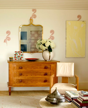
a taste of her ethnic detail-infused aesthetic
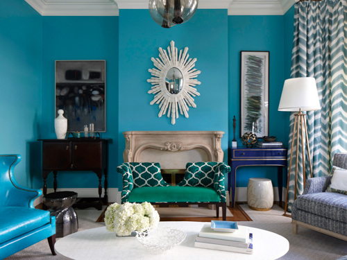
I'm a little late in sharing, but the March issue of Redbook magazine features two stories I worked on. For tips from top interior designers on decorating with a little and a lot of color, see the slideshow from the article, featuring the room above, designed by Melissa Warner Rothblum of Massucco Warner Miller. I'm a little obsessed with that royal blue console in the corner. The other story is a cute matchup of great, totally affordable armchairs and throws I found. This isn't online but it's the back page of the issue. Hope you like! 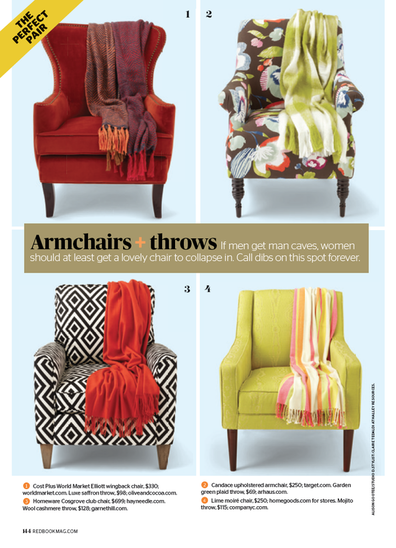
images via redbook, photographs by philip harvey and alison gootee
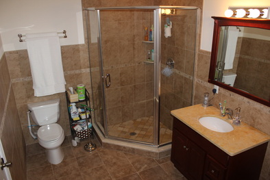
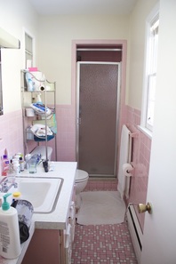
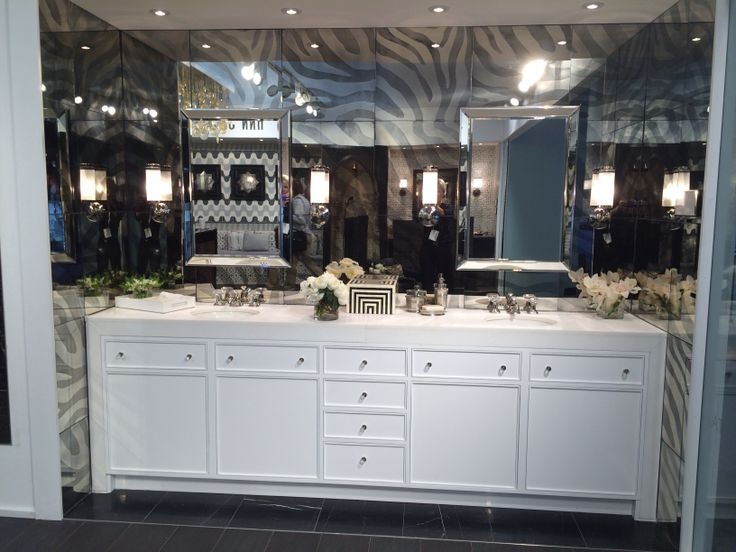
Xx a 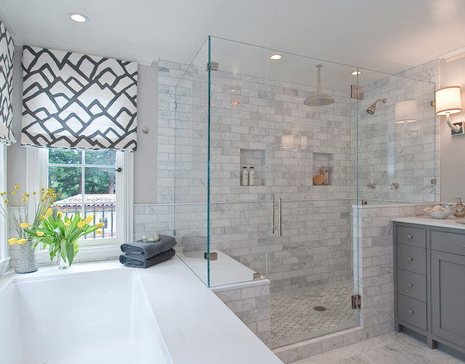 I love this bright open bathroom by Tamara Mack Design. When we moved a year and a half ago, we went from a large master bath to a retro pink wonder that the two of us can barely fit in at the same time:
While we search for a house to buy or try to decide if we should buy this house and renovate it, I can fantasize about a new bathroom with a more modern look and such fancy amenities as a fan or a window that actually opens, and my true dream: double sinks and heated floors. This year's bathroom trends include upgraded fixtures and features, and a move toward greige and pale gray tiles, a trend I am squarely behind. I am obsessed with gray. Wallpaper and hardwood floors are huge for powder rooms, specifically, over other bathrooms. Some remodeling-related bathroom trends for 2014 as determined by Houzz's survey of 7,645 homeowners:
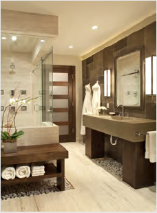
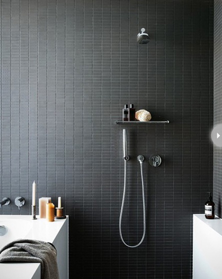
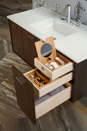
I'm with the more than four on that first point: I had a great big tub in our last house (which you can't see in the above photo because my husband was standing on the ledge of it to get that angle), and in the nearly five years we lived there, I used that tub zero times. I'm just not a bath person, and rarely do I have the time to really enjoy it (though there was this one time I took the most amazing and relaxing bath, but it was at a resort). I'm mixed on the rain shower vs. hand shower, but as long as it's not the chest or stomach level jets, I'm fine. I definitely agree with lots of light; the more natural light the better. A great deal of available natural light ties in with having a glass shower, which I love. The frameless is key, too, because keeping the frame clean was a pain. One quarter of homeowners are enlarging their master bath but three-quarters of them are creating en suite masters. In each home I've owned with my husband, we've had an en suite bathroom, and I prefer the privacy of it. Something that people are split on is having the toilet separated from the rest of the bathroom as opposed to exposed as it is in both bathrooms above. Ideally, my husband and I would love to have the toilet in a separate room. It's more private, and it means the other person can be getting ready for the day or for bed without having to wait. When it comes to cabinetry, white (36%) edged out dark and medium woods which were equal in popularity (21% each). I was a little surprised that lightwood (6%) was so unpopular. I really didn't like how dark the vanity was in our old bathroom, but when it's in a more modern setting, like the Kohler vanity below, I don't mind it as much. Even though gold and brass are gaining in popularity, silver-tone faucets were the clear favorites.
More dreamy bathroom design:
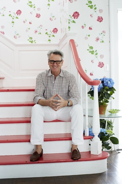 Hope you all had a splendid weekend! For the last week or so, I've been seeing this image pop up on Twitter and elsewhere, because this is New York-based interior designer Tom Scheerer, the subject of the recently-released book Tom Scheerer Decorates, by Mimi Read. I haven't yet had the pleasure of looking through the design book (it's on its way now), but this image struck me for a couple of reasons.
Film-star-spectacles aside, I love how bright and cheerful this stairway and hall are in his family's East Hampton, New York, beach house. If the stairs and handrail weren't lacquered in that coral color, I don't think I would have been as drawn to it as I am. I do like the geranium wallpaper on its own, but if the handrail had remained in a natural wood, I'm not sure I would have spent as much time absorbing the image.
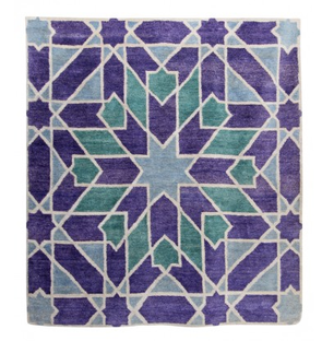
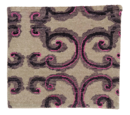
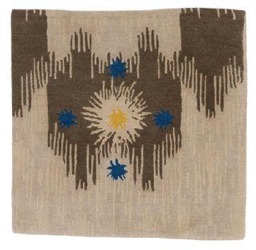
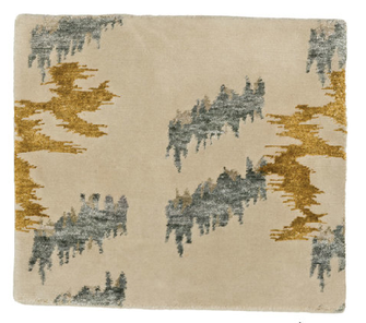
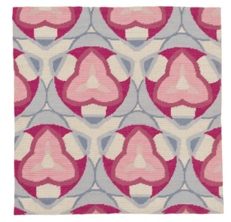
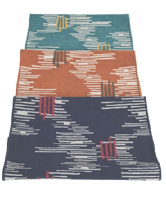
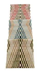
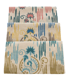
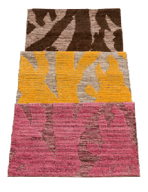
With my reasonably mediocre Photoshop skills, I filled in the coral treads and handrail with black, so I could see what it might look like. It still looked lovely, but the space took on a more serious feel. I also tried a "wood tone;" in my hands it looked a little ridiculous, but it did reinforce how much I think the coral adds to the design, particularly in a beach house where its usually desired to keep things light and airy. Painting these areas in a poppy color that coordinates with the wallpaper elevates the room that much more. I also like that the coral doesn't seem to be an exact match to any color in the paper, but that it references the floral pattern and adds another dimension of interest. I think most stairways could benefit from this kind of treatment (especially including the wallpaper). There are definitely times when natural tones, black, or white, are the right way to go, but where architecturally-interesting railings and banisters are lacking—probably most average houses—a smart paint job is a great way to update and enliven the space.  One of the things I miss most about working in New York is getting to meet and spend time with interior designers and visit their decorated spaces in person. Viewing an image of a beautiful room is wonderful, and still inspiring of course, but when you're actually in the space, talking with the designer about their choices, seeing the way objects work together, and noticing details that otherwise might be missed—well, it makes a difference. The products they create are also a window into their aesthetic perspective and a chance to own a piece of their style in lieu of hiring them, though working with any of these designers would be amazing: Interiors experts Amanda Nisbet, Katie Ridder, Carrier and Company, and Tilton Fenwick all partnered with Studio Four to design and produce a line of rugs which has just launched. Each designer/design team contributed two designs and with the variety of beautiful colorways, the collection offers a total of 24 luxe options made of New Zealand wool. Some of the offerings are ready to ship and others require a lead time (production times vary). A highlight of the exciting patterns available:
additional patterns:

Yin and yang. Shadow and light. The infamous Seinfeld black-and-white cookie episode. We're always looking to black and white to provide harmony. Black and white are huge right now, though I think truthfully we can always say that. There is a comfort in the consistency, it's always chic, and the less-confident home decorator is safe in knowing the two colors always go together and with everything else, too.
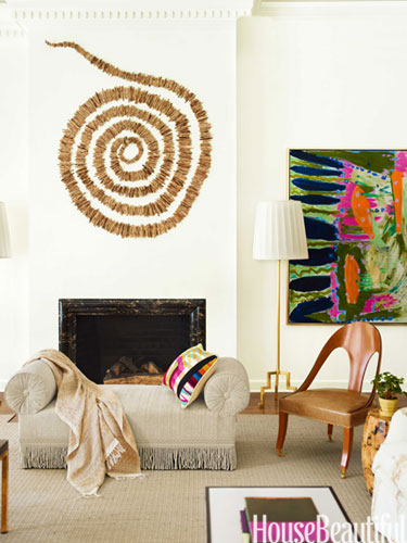
I'm on deadline for a freelance article, so forgive my brevity today (or maybe you welcome it!). Just wanted to share two excellent details from a Naples, FL beach house designed by Carrier and Company, recently featured in House Beautiful. Interior designers Jesse Carrier and Mara Miller are extremely talented, and whenever I've worked with or seen them in the past, it's been an absolute pleasure every time. Look at this insanely cool natural piece by artist Ran Adler that they chose for above the fireplace in the house's living room. I feel like at any moment it may start spinning and suck me into its vortex. I love it. Stringing, wiring, and weaving natural elements like sun-dried horsetail reeds, Adler creates undulating representations of wind and water. The unexpected material and fluidity add a great layer of texture and depth to the room. 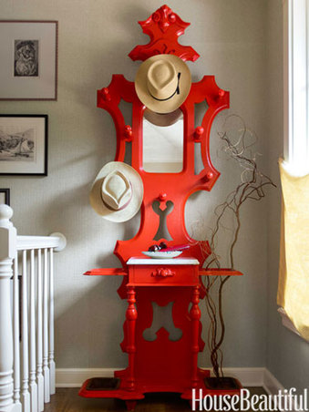
A Victorian hat rack in a vibrant lacquered red becomes a statement piece and remains totally functional. Such a lovely shape made even more special in an attention-grabbing color. I wonder if the homeowner had this piece already and they modernized it, or if the designers brought it in. Either way, wow.
I guess this was my version of brief... Click below to see the whole wonderful project. all images via house beautiful Xx a  Italian designer Paola Navone's highly-anticipated collection for Crate and Barrel debuted in select stores and online today; the line will roll out to all stores by the end of the week. It is the first of three planned collections and includes nearly 150 pieces of tabletop, furniture, textiles, lighting, and decorative accents. Paola Navone is a renowned talent with her hand in architecture, interior design, product design, and set design.
Organic shapes and a mix of materials all evoke the Mediterranean inspiration that threads itself through much of the well-traveled designer's work. 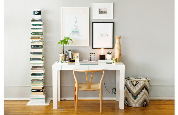
still not my place
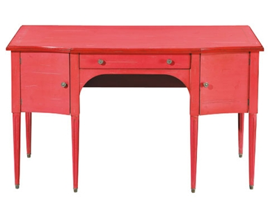
Better late than never. I've been busy this week on deadline, and then we went out to dinner with my father-in-law, who has been in town for a few days. We haven't seen him in a year and he just finally got to meet the baby, who turned 10 months today. When I bought my desk--the ubiquitous white lacquer Parsons desk from West Elm--it wasn't quite as, well, ubiquitous, as it is today. I still adore it, but sometimes I wish I had something off-beat, a little different from everyone else. The nice thing about the Parsons is that it's a great blank canvas; there are so many ways it can be styled. I am still trying to decide if I want to do brights or neutrals. Above, from The Everygirl, is a lovely neutral approach. I could easily go in this direction, and not simply because I also have the Sapien bookcase that is to the left of the desk. Maybe someday I'll go with a different style. I also love the idea of a big table as a desk. 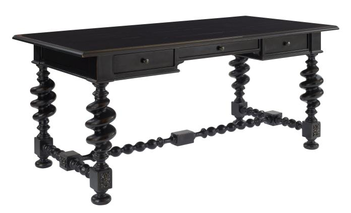
Thalia Writing Desk by Century Furniture
I think I would pair the Thalia with a few modern elements to keep it from feeling too serious. Love the ornate legs and support strut, it definitely catches the eye. 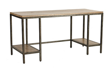
Durham Desk by Ballard Designs
The Durham has a more industrial look, with a mix of wood and aged steel. I have a Mac, but if you were someone who had a tower for your computer, it would fit nicely on one of the lower shelves so it could be kept off the floor and out of the way. 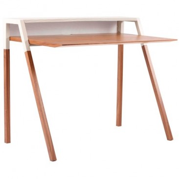
Cant Desk by Blu Dot
The cool slim silhouette of the Cant is warmed by the walnut and grey finish. This would be great for someone with a small space, or who works on a laptop so they can utilize the upper shelf for storage and decorative objects. My monitor would obscure the whole thing.
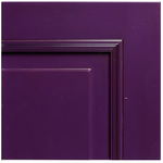
Grange's traditional, feminine Ermitage has been a favorite of mine for a few years. The piece is available in 20 paint colors and 3 distress levels. I'm not really into distressing personally, so I would choose the least distressed finish, called classique. All of their colors are great, but I always find myself drawn to the purples, so I'd pick prune for the desk. Although, this fall, Grange is debuting seven new color finishes, so I could change my mind.
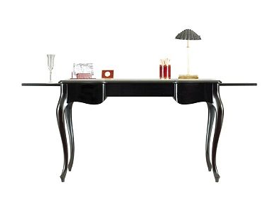
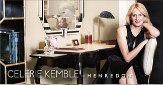
Super-talented and super down-to-earth designer Celerie Kemble designed a collection for Henredon, which includes this desk, the One Forty Five. This desk is so luxe, made of Philippine mahogany with a creme leather inlay on the main surface and two pull-out shelves. The cabriole legs add to the effect; it's a really beautiful piece. You can see the leather better in the image with Celerie. Also, that black and white mirror behind the desk is amazing! interior image via The Everygirl
desk images via Century Furniture, Ballard Designs, Blu Dot, Grange, Henredon Xx a |
#checkout this blog with shop-themed puns
archives
August 2014
categories
All
© 2014 | mrkt
|


 RSS Feed